We rarely think about logos, but we see them every day. They’re on your blender, your toothpaste, your television. In fact, you’re probably looking at more than one right now. Still, we become so used to them, it’s easy to forget how vital they are to a brand’s identity. Simply put, logos represent a brand, and if you want to build a strong brand identity, an effective logo design is a must. Therefore, it is essential to know the advantages and disadvantages of different types of logos before planning yours. In this article, we’ll discuss the pros and cons of some of the most common types of logos, and how each one can affect your brand identity.
If you do a quick Google search for the phrase “types of logos” you’ll find a variety of articles about “The 5 Types of Logos,” “The 7 Types of Logos,” “The 9 Types of Logos,” etc. Suffice to say, there’s some disagreement about how to separate logos into different types, and there’s some overlap in how to categorize them. There are plenty of logos that could reasonably fit in more than one category. In this article, we’ll be discussing the five simplest categories into which we can break down logos, and how that can help you choose what works best for your brand.
 1. Pictorial Marks
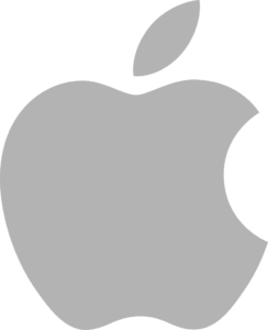
Also known as a brandmark, the pictorial mark is an extremely popular type of logo right now. If you turn your device around, it’s very likely there’s a pictorial mark on back. In fact, there’s about a 50% chance it’s this one specifically. Pictorial marks tend to be simple, containing an image logo with no text. For this reason, they tend to represent well known brands that don’t feel they need to include their name in the logo. Often, pictorial marks evolve from combination marks or emblems, which we’ll discuss later in this article. One famous example of this was Starbucks, which removed its name from the outer ring of its iconic mermaid logo to better feature the pictorial mark inside. Pictorial marks are meant to be instantly recognizable and form a cognitive relationship to the brand, but they have a major benefit in the modern marketing landscape. With so many people viewing websites on cell phones and tablets, and so many brands launching mobile apps, having a logo that can easily transform into an icon is essential.
 2. Abstract Marks
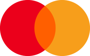
An abstract mark generally refers to any image or symbol logo that isn’t based on a word or thing. An excellent example of this is the Mastercard logo. Until a few years ago, it would’ve fallen into two categories, as the previous logo still had “mastercard” printed below, and therefore would’ve made it a combination mark as well, but in 2019, Mastercard felt that just three years after the release of this version, the logo was recognizable enough to drop the name and become a standalone abstract mark. The line between an abstract mark and a pictorial mark can be a fine one, but ultimately it comes down to how you portray your brand.
3. Wordmarks and Lettermarks
A wordmark is exactly what it sounds like. It’s a logo that consists of the name of the brand. It generally has a specific font, color, and sometimes a specific background. Similarly, Lettermark logos often follow the same pattern but using a brand’s acronym or abbreviation, such as the Louis Vuitton logo which features an LV monogram. Logos for brands that are known simply by their acronym such as HBO ![]() or IBM would also be called lettermarks. Often wordmarks and lettermarks use custom fonts like in the case of google, or make slight changes to an existing font like in the cases of the Visa logo or the Subway logo. Because of the simplicity of wordmark logos, they can be both the easiest and most difficult to create. On the one hand, they can come together relatively quickly compared to a more complex pictorial mark, but on the other hand, their simplicity is in and of itself a challenge, daring the designer to make the wordmark or lettermark stand out, without compromising the simplicity that gives it appeal in the first place.
or IBM would also be called lettermarks. Often wordmarks and lettermarks use custom fonts like in the case of google, or make slight changes to an existing font like in the cases of the Visa logo or the Subway logo. Because of the simplicity of wordmark logos, they can be both the easiest and most difficult to create. On the one hand, they can come together relatively quickly compared to a more complex pictorial mark, but on the other hand, their simplicity is in and of itself a challenge, daring the designer to make the wordmark or lettermark stand out, without compromising the simplicity that gives it appeal in the first place.
 4. Combination Marks
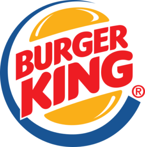
I’ve mentioned combination marks a few times throughout this article. A comb![]() ination mark simply refers to any logo where text and imagery are combined. There are several types of combination marks. One famous example is the Burger King logo. As you can see, the Burger King logo incorporates the text directly into the pictorial mark, making it a part of the actual image. Another example we could look at is the Chipotle logo. The Chipotle logo puts their pictorial mark in the center surrounded by the text. Although these are different uses of the style, they would both be considered combination marks.
ination mark simply refers to any logo where text and imagery are combined. There are several types of combination marks. One famous example is the Burger King logo. As you can see, the Burger King logo incorporates the text directly into the pictorial mark, making it a part of the actual image. Another example we could look at is the Chipotle logo. The Chipotle logo puts their pictorial mark in the center surrounded by the text. Although these are different uses of the style, they would both be considered combination marks.
Many people disagree about how to break up these categories and for the purposes of this article we’ve simplified it as much as possible, but there are other ways to get even more specific. You could classify certain lettermarks as letterforms, which generally refers to logos based on a single letter (often the first letter in the brand’s name) such as McDonalds or Tesla. Many combination marks could be classified as emblems, such as the NFL logo or the Harley Davidson logo. Do you have a favorite logo? Have you ever designed one yourself? If so, how did you do it? Let us know in the comments.